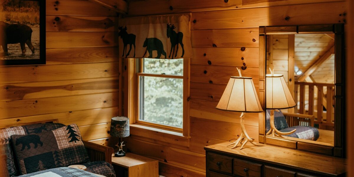
Exploring the Arts and Crafts Color Palette
The Arts and Crafts movement, which emerged in the late 19th century, championed handcrafted quality and natural aesthetics. Central to this ethos is the color palette. This palette is more than a collection of popular colors; it’s a philosophy of design. It emphasizes simplicity, utility, and beauty drawn from the natural world.

The Origins of the Arts and Crafts Movement
William Morris, a key figure in the Arts and Crafts movement, encouraged artists and designers to return to traditional techniques. This period reacted against the mechanization of production, focusing on handmade objects. Colors in the Arts and Crafts palette reflect nature’s tranquility and hues.
Key Colors in the Arts and Crafts Palette
Color choices in Arts and Crafts design are anchored in earth tones. These shades provide warmth and harmony. Below are some commonly used colors:
- Earthy Browns: Emulate the hues of natural wood and soil, offering a grounding effect.
- Deep Greens: Inspire thoughts of lush forest foliage and tranquility.
- Rustic Reds: Represent the warm tones of natural clay and autumn leaves.
- Soft Golds: Reflect the glow of sunset and the subtleness of dried grasses.
- Burnt Oranges: Mirror the vibrant colors of a setting sun and fire’s embers.
- Muted Blues: Evoke a sense of calm and are reminiscent of a serene sky.
- Naturals and Creams: Provide a neutral backdrop akin to unbleached linen and sheep’s wool.
The Role of Natural Dyes
In line with the movement’s values, artists often used natural dyes. These offered a depth that synthetic dyes couldn’t match, adding authenticity. Some common natural dyes included indigo for blue shades, madder root for reds, and walnut husks for browns. The limited range of natural dyes helped maintain the subtle and muted tones that are characteristic of the movement.
Application in Textiles and Wallpapers
Textiles and wallpapers are a significant aspect of the Arts and Crafts style. Patterns include florals, foliage, and pastoral scenes, often framed by these rich, natural colors. This color application emphasized the integration with natural surroundings, creating cohesive, organic spaces.
Furniture and Woodwork Color Choices
Furniture in the Arts and Crafts style often showcased wood’s natural beauty, either left in its natural state or stained to enhance the grain. Oak, mahogany, and maple were commonly used. These choices were augmented by the color palette, unifying the room’s aesthetic. Soft textiles in complementary colors would be used for cushions or throws.
Ceramics and Pottery
In ceramics, glazes mirrored the natural color palette. Matte and semi-matte finishes were favored over glossy ones, emphasizing texture over shine. Deep greens, warm browns, and rich blues were common in pottery, grounding the objects in an earthy feel.
Choosing Colors for Modern Interpretations
Modern interpretations of the Arts and Crafts palette continue to honor simplicity and natural beauty. When choosing colors for contemporary design, consider these historical roots. Opt for the muted, nature-inspired hues to maintain authenticity. Experiment with different shades within the same color family to add depth and variety while adhering to the palette.
Incorporating the Palette in Various Media
Painting with an Arts and Crafts palette involves blending and layering colors to create naturalistic effects. In printmaking, the color choices might be more restrained, focusing on a few hues to highlight the design’s intricacies. Stained glass work also follows this palette, with rich, translucent colors inspired by nature.
Color Psychology and the Arts and Crafts Palette
Each color in the Arts and Crafts palette carries psychological effects. Browns and greens are calming and grounding, ideal for creating relaxing spaces. Reds and oranges add warmth and can stimulate conversation and activity. Blues convey a sense of peace, suitable for areas designed for rest or contemplation. These choices create harmonious living spaces that are both beautiful and functional.
Collaborative Designs
The collaborative nature of the Arts and Crafts movement often involved multiple artisans working together. This collaboration ensured that color schemes were consistent across various elements like furniture, textiles, and ceramics. The result was a cohesive and balanced aesthetic that is still admired today.
Learning from the Masters
Examining works by leaders of the Arts and Crafts movement can provide insight and inspiration. Look at the tapestries of William Morris, which often feature rich yet muted colors. Study the intricate patterns and harmonious colors in Charles Voysey’s wallpapers. These examples highlight how to effectively use the Arts and Crafts color palette in design.
Creating Your Color Palette
To create your palette, start by selecting a dominant color that resonates with you. Complement this with secondary colors that harmonize well. Finally, choose accent colors that add interest and variation. Focus on balance and avoid overly bright tones to stay true to the Arts and Crafts aesthetic.
The Arts and Crafts color palette is not merely a set of colors but a design philosophy that emphasizes natural beauty and handcrafted quality. Understanding and applying this palette can lead to creating spaces and objects that are timeless, harmonious, and grounded in history.


Stay in the loop
Get the latest wildlife research and conservation news delivered to your inbox.