Subway Tile or Handmade: Craftsman Tile Choices for Kitchen and Bath
Tile selection in a Craftsman home is one of those decisions that looks simple on the surface and then swallows you whole. The wrong tile — too glossy, too uniform, too obviously modern — undercuts even the most carefully restored woodwork. I’ve seen beautiful bungalows with original quarter-sawn oak trim paired with tile that belongs in a 2015 condo flip, and it’s genuinely painful. Getting this right means understanding what original Craftsman homes actually used and which modern options capture that same feel without requiring a time machine.
The Original Craftsman Tile Aesthetic
Arts and Crafts designers didn’t treat tile as just a waterproof wall covering — they treated it as an artistic medium that had to earn its place in the room. That philosophy shows up in a few consistent ways:
Handcrafted appearance: Tiles with visible variation were the whole point. Slight color differences tile to tile, undulating surfaces, edges that aren’t laser-straight — this was celebrated rather than quality-controlled away. The entire Arts and Crafts movement centered on valuing human craftsmanship over industrial uniformity, and tile was no exception.
Matte glazes: Original Craftsman tile had matte or satin finishes, not the high-gloss sheen you see in most big-box stores today. Those soft surfaces absorbed light instead of bouncing it around the room, creating warmth in bathrooms that often had just one window for natural light.
Earth-derived colors: Green, brown, amber, blue-gray, and cream — these were the Craftsman palette, and they all came from natural mineral and oxide-based glazes. No neon, no pure white, no colors that couldn’t plausibly exist in nature.
Simple shapes: Squares, rectangles, and hexagons. That’s largely it. If you’re looking at elaborate decorative shapes, complex mosaic patterns, or tiles with printed designs, you’ve wandered into Victorian or contemporary territory. Craftsman tilework let the material and color do the talking.
Subway Tile: The Versatile Standard
Subway tile actually appeared in original Craftsman homes, which makes it a safe choice — but the details of how you execute it make the difference between period-appropriate and Pinterest-generic.
Proportions matter: Classic subway tile is 3″ x 6″ — that 1:2 ratio creates a visual rhythm that your eye recognizes even if you can’t articulate why. Modern variations like 2″ x 4″, 4″ x 8″, or 4″ x 12″ alter the aesthetic significantly. For a Craftsman home, stick with the traditional dimensions unless you have a specific design reason to deviate.
Finish selection: This is where most people go wrong. High-gloss subway tile reads modern, full stop. What you want is matte, crackle-glazed, or handmade-look subway tiles. Beveled edges add period-appropriate shadow lines that give the wall depth and texture. The difference between a $3/square foot glossy subway and a $8/square foot matte crackle-glaze is enormous in the finished room.
Color choices: White and cream are classics that always work, but original Craftsman homes also used soft greens, pale blues, and warm grays. If your room has rich wood trim that can handle some color on the walls, consider stepping away from the default white. A sage green subway tile against dark oak wainscoting is a combination that’ll stop people in their tracks.
Installation patterns: Running bond — the traditional offset pattern — is the standard and the safest choice. Stack bond (tiles aligned in a grid) reads more contemporary. Herringbone can work in some Craftsman contexts but tends to feel busy in the modestly sized bathrooms and kitchens these homes typically have.
Handmade and Artisan Tiles
If you want to truly nail the period feel, handmade tile delivers something factory tile simply cannot replicate. The trade-off is cost and installation complexity, but the result is worth it for the right project.
Surface variation: Each handmade tile varies slightly in thickness, surface texture, and color intensity. When installed, this variation creates depth and visual richness that uniform tile lacks. It’s the difference between a wall that feels alive and one that feels like a showroom display.
Color depth: Artisan glazes develop unique characteristics during kiln firing that can’t be replicated mechanically. No two tiles come out identical, and when you cover a wall with hundreds of them, you get an organic appearance that defined original Craftsman tilework. The color seems to shift as light moves across the wall through the day.
Edge character: Irregular edges create shadow lines and grout joints that vary slightly in width. In factory tile, this would be a defect. In handmade tile, it reads as intentional craftsmanship — which is exactly what the Arts and Crafts movement was about.
Sources: Fireclay Tile, Pratt and Larson, Mercury Mosaics, and Motawi Tileworks all produce handmade tiles appropriate for Craftsman homes. Expect to pay $15-50+ per square foot, which stings until you see the installed result.
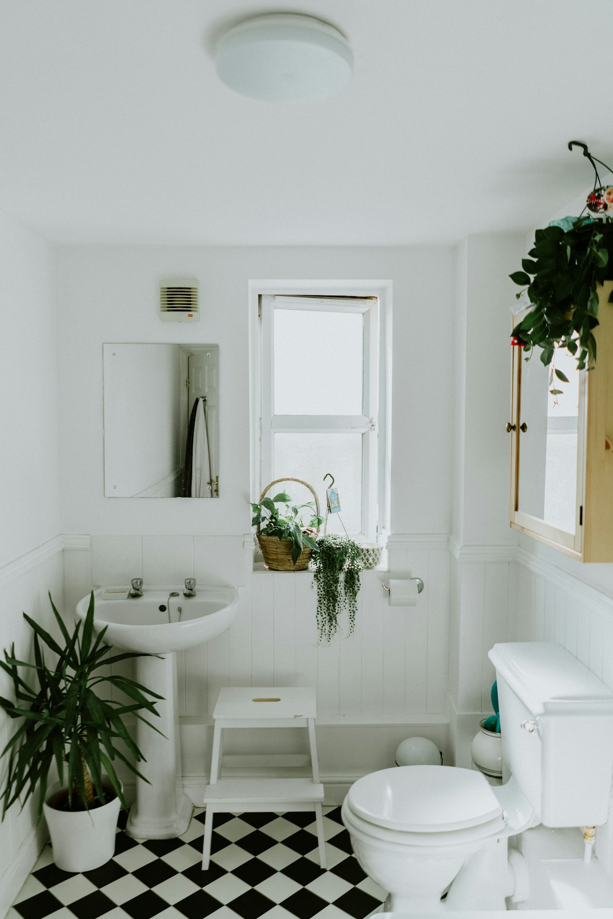
Hex Tile: The Period Floor Favorite
Hexagonal floor tile showed up in so many original Craftsman bathrooms that it’s practically a period signature. Getting it right is straightforward if you pay attention to a few details:
Size matters: Traditional hex tile measured 1″ to 2″ across. That small scale creates a dense, richly textured floor surface. Modern large-format hex at 3″ or bigger reads as contemporary and looks out of place in a period bathroom. Stick with the smaller sizes.
Color patterns: Classic installations used single colors — usually white — or simple two-color borders. A white field with a black border is completely authentic. What isn’t authentic: complex multi-color patterns, elaborate medallions, or decorative insets. Those are Victorian, not Craftsman.
Unglazed options: Original hex tile was frequently unglazed porcelain, giving it a matte, slightly rough surface. That texture provides real slip resistance in a bathroom — a functional benefit that glossy tile can’t match. Seal unglazed tile properly and it handles bathroom moisture without issues.
Modern alternatives: Daltile and American Olean both produce reproduction hex tile that captures the period look at reasonable prices. For higher character, handmade hex tile is available from artisan producers at correspondingly higher cost.
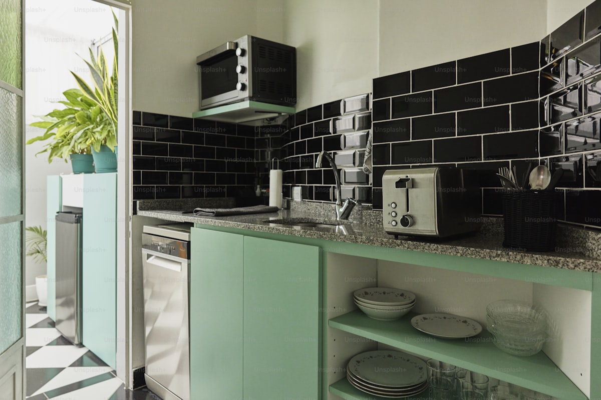
Kitchen Tile Applications
Craftsman kitchens used tile differently than what most people expect, and understanding the original approach prevents over-tiling:
Backsplash restraint: This is the one that surprises people. Original Craftsman kitchens often had limited or no tile backsplash — painted walls or wainscoting extended behind work areas instead. When tile did appear, it was typically a single row behind the sink or a modest area behind the stove. Full wall-to-wall backsplashes tiling up to the cabinets are a modern convention.
Countertop edge tiles: Some period kitchens featured tile countertops with bullnose or cove edge tiles. This application can work in a restoration, but it requires very careful execution and color selection to avoid looking like a 1970s or 80s kitchen — those decades used tile countertops extensively but with very different aesthetics.
Floor tiles: Kitchen floors in Craftsman homes were more commonly wood or linoleum than tile. When tile floors did appear, they used simple patterns in durable materials. Don’t feel obligated to tile a kitchen floor just because it’s a “kitchen thing” — wood floors are perfectly period-appropriate.
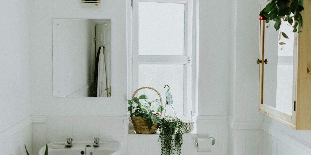
Bathroom Floor Considerations
Hex remains the standard: White or cream hexagonal tile is the most historically accurate bathroom floor choice for Craftsman homes. It works in small powder rooms and larger master baths alike, and it’s one of those choices that looks right in virtually any period bathroom.
Basketweave alternative: If straight hex feels too predictable, basketweave patterns — rectangular tiles arranged in alternating perpendicular pairs — appeared in period bathrooms as a legitimate alternative. It’s busier than hex but still firmly within the Craftsman vocabulary.
Threshold treatment: Here’s a detail that separates good restorations from great ones: original bathrooms often had marble or tile thresholds where bathroom tile met hallway wood floors. Recreating this transition detail adds a level of authenticity that visitors feel even if they can’t identify what’s making the room feel “right.”
Scale to the room: Small bathrooms handle 1″ hex beautifully; larger rooms can step up to 2″ hex without appearing too busy. Resist the temptation to use oversized tile that overwhelms the proportions of what’s typically a modest-sized room.
Colors for Craftsman Tilework
Color is where Craftsman tile really distinguishes itself from other periods, and getting the palette right matters:
Greens: From sage to forest, green was the defining color of Arts and Crafts tilework. Grueby Pottery’s famous cucumber green influenced an entire generation of tile installations, and that influence persists. A green tile accent in a Craftsman bathroom connects you to over a century of design tradition.
Browns and ambers: Warm earth tones created visual continuity between interior tile and the exterior stonework and woodwork that defined Craftsman exteriors. These colors work particularly well in homes with darker wood trim — the tile feels like it belongs to the same material family as the oak or fir around it.
Blues: Soft blue-grays, not bright or navy blues. Think weathered denim or the patina on aged copper. Craftsman blues are quiet and atmospheric, not bold or graphic.
Creams and whites: Not stark, bright white — warm whites and cream colors that harmonize with aged woodwork rather than visually fighting it. A cool pure white tile next to century-old oak makes the wood look dirty. A warm cream makes them look like they’ve always been together.
Grout Selection
Grout affects the final appearance as much as the tile itself, and it’s the decision most people make last when it should be made alongside tile selection:
Color matching: Matching grout to tile color minimizes the visible grid pattern and lets the tile surface dominate visually. This works well for wall tile where you want a unified surface rather than a graphic pattern.
Contrasting grout: Dark grout with light tile — or the reverse — emphasizes individual tiles and the geometric pattern they create. This is period-appropriate for hex floors (where the pattern IS the design) and some subway tile installations where you want to see the brick-lay rhythm.
Width matters: Narrow grout lines at 1/16″ to 1/8″ create a refined, tight appearance. Wider joints at 3/16″ or more read as rustic and also serve a practical purpose: they accommodate the slight irregularities in handmade tiles that would crack narrow grout lines.
Installation Considerations
Prep work: Tile over properly prepared substrate — period. Older homes may need backer board installation or a mortar bed before any tile goes up. Skipping substrate prep is the fastest way to watch your investment crack and pop off the wall in two years.
Layout planning: Dry-lay tiles before committing to adhesive. Plan your cuts and verify symmetry. Period bathrooms were typically small, which means every cut tile edge is visible and noticeable. Bad cuts in a tiny bathroom have nowhere to hide.
Period-appropriate accessories: Original Craftsman bathrooms often had soap dishes, toothbrush holders, and towel bar brackets built directly into the tile installation — not surface-mounted hardware stuck on as an afterthought. Reproduction period accessories that install flush with the tile surface are available and worth the extra effort to source.
That’s what makes Craftsman tile choices endearing to us old-house enthusiasts — every decision connects to a design philosophy that valued honest materials, human craftsmanship, and the idea that even a bathroom should feel considered rather than slapped together. Whether you invest in handmade artisan tiles or work with affordable reproductions, understanding the period aesthetic ensures your tile decisions feel authentically Craftsman rather than generically “vintage.”


Stay in the loop
Get the latest craftsman charm updates delivered to your inbox.