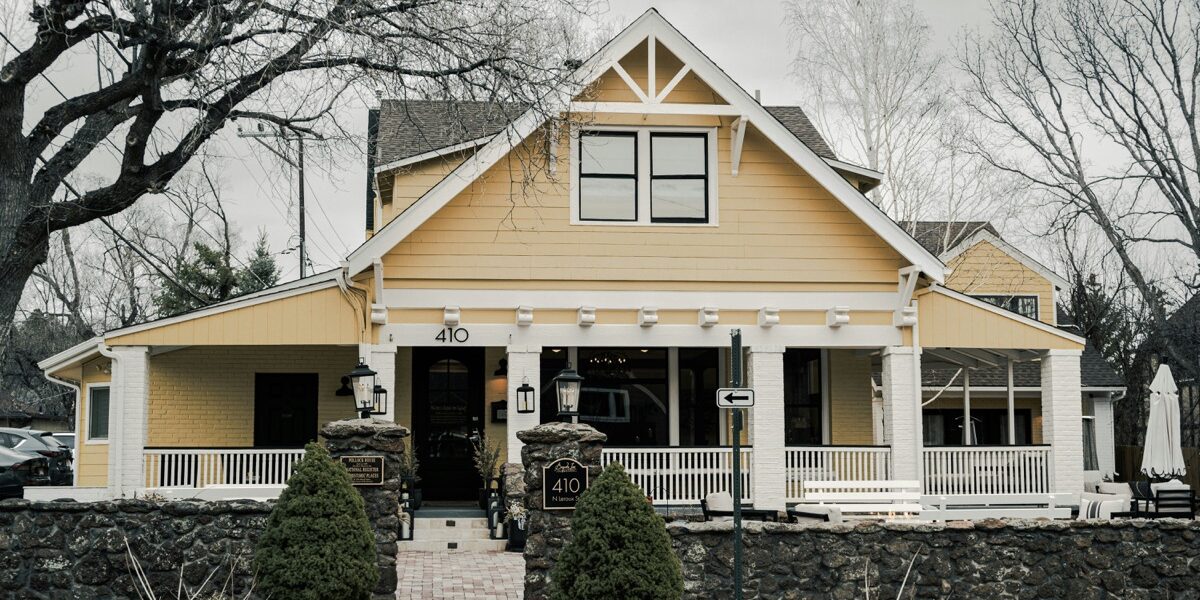
The Authentic Craftsman Color Palette
Walk into a well-preserved Craftsman bungalow from 1910 and the colors hit you before you notice the woodwork. Everything feels grounded, warm, and deliberately natural — the opposite of the ornate Victorian palettes these homes were built to reject. Those color choices weren’t accidents or personal preferences. Arts and Crafts designers developed specific color philosophies, and understanding them is the difference between a Craftsman home that feels right and one that just has nice trim.
The Philosophy Behind Craftsman Colors
Gustav Stickley — the furniture maker and publisher of The Craftsman magazine — advocated for colors “found in nature at rest.” Not nature screaming at you during a tropical sunset, but nature sitting quietly in an autumn forest. This philosophy drove the entire palette toward earthy, muted tones that would harmonize with natural wood, stone, and handcrafted materials rather than competing with them.
What Craftsman colors specifically reject: bright primaries, artificial hues, and anything that reads as manufactured. Instead, they draw from autumn forests, weathered stone, aged leather, and oxidized metals. The goal was interiors that felt honest and organic — rooms where the materials and colors seemed to belong together naturally rather than being imposed by a decorator.
Essential Earth Tones
Every Craftsman palette starts with earth. These aren’t trendy paint colors that cycle in and out of fashion; they’re foundational colors that have worked for over a century:
Warm Browns: Think oak bark, not chocolate. Craftsman browns have golden and amber undertones, reflecting the quarter-sawn oak that shows up everywhere — built-ins, trim, furniture, floors. Benjamin Moore’s “Saddle Brown” (2164-10) and Sherwin-Williams “Steady Brown” (SW 6110) capture this warmth without crossing into muddy territory.
Soft Tans: The workhorse wall color in most Craftsman homes. These aren’t beige and they aren’t cream — they’re genuinely tan, like sun-dried grass or sandy clay. The point is providing a warm background that lets the woodwork shine rather than competing with it. Benjamin Moore “Lenox Tan” (HC-44) and Sherwin-Williams “Whole Wheat” (SW 6121) are both solid starting points.
Terra Cotta: Used as accent colors rather than dominant walls, these muted oranges show up in tile work, pottery, and occasional trim details. They reference clay, brick, and the warm side of the sunset spectrum. Benjamin Moore “Potters Clay” (1221) nails the tone — earthy orange without veering into pumpkin spice territory.
Forest Greens: The Signature Color
If there’s one color that says “Craftsman” more than any other, it’s deep forest green. Not bright kelly green, not blue-green teal, but the dark, complex green of pine forests in late afternoon shadow. This was the Craftsman signature color, and getting it right immediately signals period authenticity.
Exterior trim green: Craftsman homes frequently paired earth-toned siding with deep green trim around windows, doors, and porch elements. This green approximated Douglas fir needles or moss on stone — natural, dark, and grounding. Sherwin-Williams “Ripe Olive” (SW 6209) and Benjamin Moore “Forest Green” (2047-10) both work well here.
Interior accent green: Slightly lighter versions showed up on interior woodwork in dens and libraries. These greens complemented golden oak tones while adding depth to rooms that were originally lit by warm incandescent light — and they still work beautifully under warm LED bulbs today.
Tile and pottery green: Matte-glazed Grueby tiles, beloved in Craftsman fireplaces, featured distinctive cucumber greens and sage tones. These softer greens work well in kitchens and bathrooms where the deep forest shades would feel too heavy and cave-like.
Dusty Reds and Burgundies
Craftsman reds are emphatically not bright. They’re the color of old brick, dried leaves weeks after falling, or leather that’s been sitting in the sun. These muted reds add warmth to a room without screaming for attention:
Accent walls: A single wall in deep, dusty red creates dramatic focus in dining rooms and libraries — rooms where you want a sense of warmth and enclosure. Benjamin Moore “Dinner Party” (AF-300) captures that sophisticated, aged quality where the red feels like it’s been there for decades.
Exterior elements: Deep burgundy works on front doors and shutters, providing contrast against tan or brown siding while staying firmly within the earthy palette. A burgundy door on a brown house with green trim is about as authentically Craftsman as exteriors get.
Textiles: Craftsman rugs and upholstery incorporated these reds constantly — typically in geometric patterns paired with gold, brown, and green. If you’re shopping for period-appropriate textiles, these color combinations are your guide.
Golden Yellows and Ambers
Quarter-sawn oak naturally trends golden, and the Craftsman color palette echoes this warmth:
Wall glazes: Period homes sometimes featured walls with subtle golden glazes over base coats, creating depth and movement that shifted throughout the day. The modern equivalent is simply using a good golden wall color — Benjamin Moore “Stuart Gold” (HC-10) achieves a similar effect without the labor of actual glazing techniques.
Stained glass: Craftsman light fixtures and decorative windows used amber and honey-colored glass extensively, casting warm light throughout interiors. This is worth considering if you’re selecting replacement lighting — the color temperature of the light matters as much as the fixture style.
Hardware finishes: Brass and bronze hardware picks up golden tones, creating visual continuity between architectural metalwork and the woodwork it’s mounted on. This connection between materials is central to the Craftsman design philosophy.
Soft Blues and Blue-Grays
Blue plays a supporting role in the Craftsman palette rather than a starring one:
Bedroom ceilings: Pale blue ceilings referencing the sky appeared in some Craftsman bedrooms. These weren’t the bright blue you see in Southern porch ceiling traditions but something much more muted, pushed toward gray.
Bathroom tile: Matte blue tiles provided variation from the dominant earth tones. These blues were soft and almost dusty — never bright, never navy, never electric. Think faded denim or the color of the sky just before dusk.
Exterior accent: Muted blue occasionally appeared on porch ceilings or in trim details, particularly in homes influenced by coastal California Arts and Crafts traditions where the blue referenced sea and sky.
What to Avoid
Certain colors undermine Craftsman authenticity no matter how carefully you apply them:
Bright whites: Craftsman interiors avoided stark white. Trim was stained to match woodwork or painted in cream, tan, or green. White walls read as blank and cold against warm wood — and that cold contrast is the opposite of what Craftsman designers were after.
Gray as a dominant color: The current all-gray-everything trend directly contradicts Craftsman philosophy. Gray reads as industrial, not natural. Blue-grays have minor supporting roles, but gray walls in a Craftsman home feel fundamentally wrong, regardless of what the current Pinterest trends suggest.
Saturated primaries: Bright red, blue, and yellow belong to other design traditions. Craftsman colors are always muted, complex, and grounded. If a color looks like it came from a crayon box, it doesn’t belong in a Craftsman home.
Cool undertones: Even when using browns and tans, make sure they trend warm — yellow and red undertones rather than gray and blue undertones. Cool browns and tans fight against warm wood rather than supporting it.
Practical Application: Room by Room
Living room: Warm tan walls, forest green or brown trim, golden oak built-ins, dusty red accents in rugs and upholstery. This is the classic formula and it works because every element supports every other element.
Dining room: Consider a single accent wall in deep burgundy or forest green, with remaining walls in warm tan or gold. Trim should match your oak woodwork. The accent wall creates drama appropriate for the room where you entertain.
Kitchen: Sage green or warm cream on upper walls. Natural wood or painted lower cabinets. Tile backsplash in matte greens, browns, or terra cotta. Kitchens can handle slightly lighter, brighter versions of the Craftsman palette since they benefit from an airy feel.
Bedroom: Softer versions of the palette work best here. Warm cream walls, wood trim, textile accents in green and gold. Bedrooms don’t need the drama of burgundy accent walls — restfulness comes from keeping things gentle.
Bathroom: This is your opportunity for matte tile in blue, green, or terra cotta. White fixtures are completely appropriate — they were standard in the period. The tile provides the color personality.
Exterior: Brown, tan, or olive body color. Deep green or brown trim. Burgundy or forest green front door. Stone foundation and porch columns in natural gray or brown. The exterior palette should look like it grew out of the landscape.
Modern Paint Matches
For anyone restoring or building a Craftsman home, these specific paint lines offer reliable period-appropriate colors:
Benjamin Moore Historic Collection: HC-44 Lenox Tan, HC-83 Tyler Gray (actually reads as warm taupe despite the name), HC-116 Guilford Green
Sherwin-Williams Historical Collection: SW 6110 Steady Brown, SW 6121 Whole Wheat, SW 6209 Ripe Olive, SW 0012 Rustic Red
Farrow & Ball: Card Room Green, London Clay, Vert de Terre, Oxford Stone
When selecting colors, always test samples on actual walls and view them in both natural daylight and whatever artificial lighting you use in the evening. Craftsman colors shift dramatically depending on light quality, which was actually intentional — these homes were designed before electric lighting was standardized, and the colors were chosen to look warm and rich under both conditions.
That’s what makes the Craftsman palette endearing to us old-house enthusiasts — these colors create spaces that feel timeless because they reference natural elements rather than decorating trends. Get the palette right and your home’s character emerges on its own. Get it wrong and no amount of beautiful woodwork saves the room.


Stay in the loop
Get the latest craftsman charm updates delivered to your inbox.